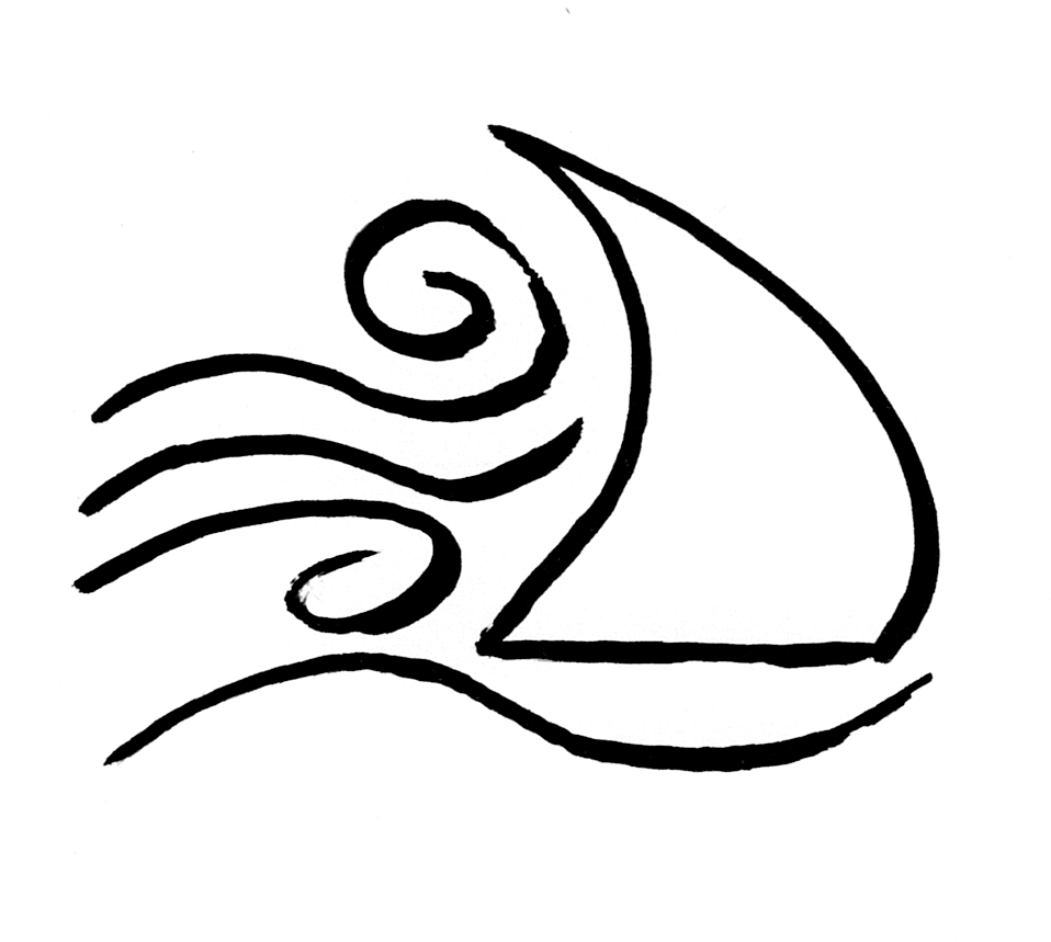
The visual identity of these books and this website is small and quiet on purpose. This page exists to say a little about why.
The symbol on every spine, in the corner of every back cover, and at the heart of this site is a sail catching wind. It comes from John 3:8: "The wind blows wherever it pleases. You hear its sound, but you cannot tell where it comes from or where it is going. So it is with everyone born of the Spirit."
I have come to hold this verse as the deepest theology of how I work. We do not make the wind. We raise the sail. The Spirit moves on His own; the Christian life is responsive to that movement, not generative of it. Showing up, paying attention, choosing the practice — that is the sail. The wind is His.
It is also one of the three quiet realities that have anchored my faith since the earliest years: epiphany, simplicity, John 3:8. The sail makes the third visible.
The drawing on the front of So I Ask Myself is a hand mirror. It is the oldest image in that book and probably the simplest. Self-knowledge is not something we manufacture; it is something given when we stop long enough to look. The mirror, like the book itself, holds to simplicity — clearing away what is not essential so what matters can be seen.
Every book in the series has a single drawing on the front, in the same line-weight, done by hand. The drawing always points to the heart of the book — bread being broken, an open door, a small fire ringed with stones, a sail catching wind. One image. One idea. Nothing else.
Simplicity is one of the three anchors. It is both a theological claim about how God reveals Himself — accommodating to human capacity without losing His transcendence — and a lifestyle posture of clearing away what is not essential so Jesus remains in focus.
What it means for the design:
The same posture shapes this website. White space, restrained typography, no popups, no chasing the reader. The site is meant to feel the way the books feel — quiet, slow, warm.
The colours across the catalogue are muted and warm — natural pigments rather than digital or neon. Each book gets its own colour, but every colour belongs to the same family. When the books are lined up on a shelf, they look like a body of work, not a collection of individual products.
The fonts are Outfit for titles and headings, Lato for body text. Clean modern sans-serifs, similar in spirit to what the surrounding Christian community uses, but distinct enough to give the books their own identity. No serif. No display fonts. Nothing that calls attention to itself.
Books are read with the body. The paper, the weight in the hand, the typography on the page, the colour of the ink — all of it shapes whether the book becomes a friend or a stranger. These choices are small but they are not invisible.
I draw and paint. I prefer to do things with my own hands when I can. The cover, sketch, and symbol of every book are designed by me. This is not a marketing decision. It is the same posture I bring to a workshop or a kitchen or a notebook. The slow, tangible work of making is, for me, a form of prayer — shaped in part by Brother Lawrence, who taught the church that God's presence can be practised over a sink as truly as in a sanctuary.
The covers are not perfect. They were not meant to be. They are honest, made by a person rather than a brand. If you look closely, you will see the line-weight is uneven in places. That is on purpose. A book made by a person should look like it was made by a person.
This is what the catalogue will look like as it grows. Twenty-two books, each with its own colour and drawing, all sharing the same visual DNA. Most are not yet written. A few are in progress. One is in your hands.
The order matters. The colours are not random — they are paired with what each book is about. Sand for self-examination. Terracotta for the table. Sage for new beginnings. Deep burgundy for the daily prayer book. Rich earth brown for church planting. Each book is a small offering. The shelf is the body of work over time.
We do not make the wind. We raise the sail.